§ Case study · Empik · 2021—2022

Empik is one of Poland's biggest media brands. I was the only designer on two of its apps — Empik Music and Empik Go — owning the work end to end, from research to final UI.
§ 01 Context
What I walked into.
Empik Music is a music streaming app, and Empik Go is for e-books and audiobooks. Both were competing for attention against far bigger global players.
§ 02 — Story 01 · Empik Music

From MVP to a product that competes.
Empik Music was an MVP — core features only, more skeleton than a finished product.
Make it competitive — modern design, intuitive UX, new features, and a landing page to match.
A redesigned app on modern patterns, UX validated through research, and a stylish landing page.
The process.
-
01 · UX research
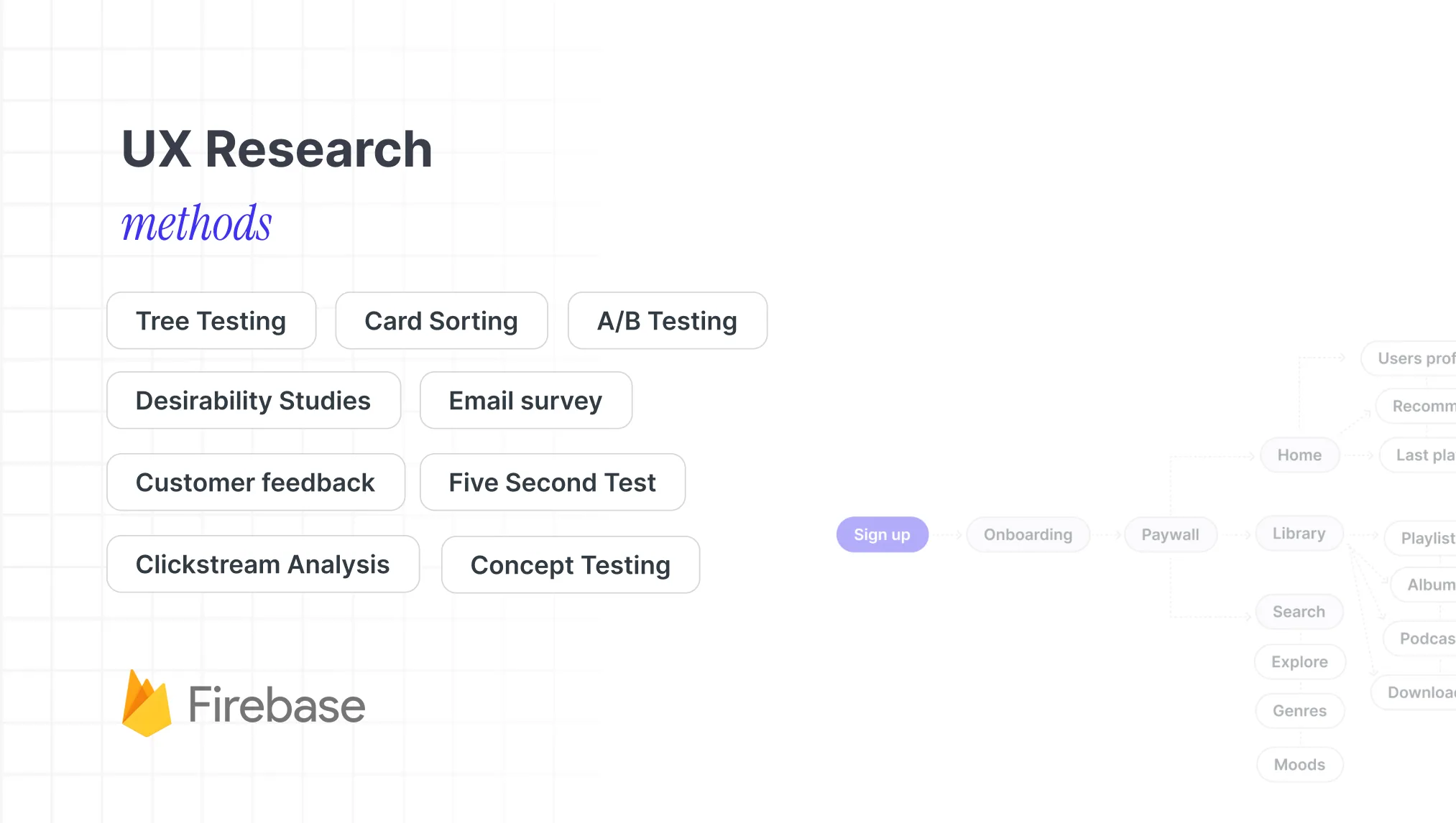
Research drove the redesign — even without a formal study budget. In a company Empik's size, I tested with colleagues from other teams: fresh, unbiased eyes that didn't know the product. With real users: A/B tests in production, App Store and Play review analysis, and email surveys.
-
02 · Design system
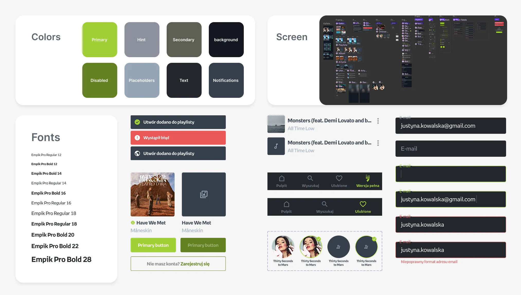
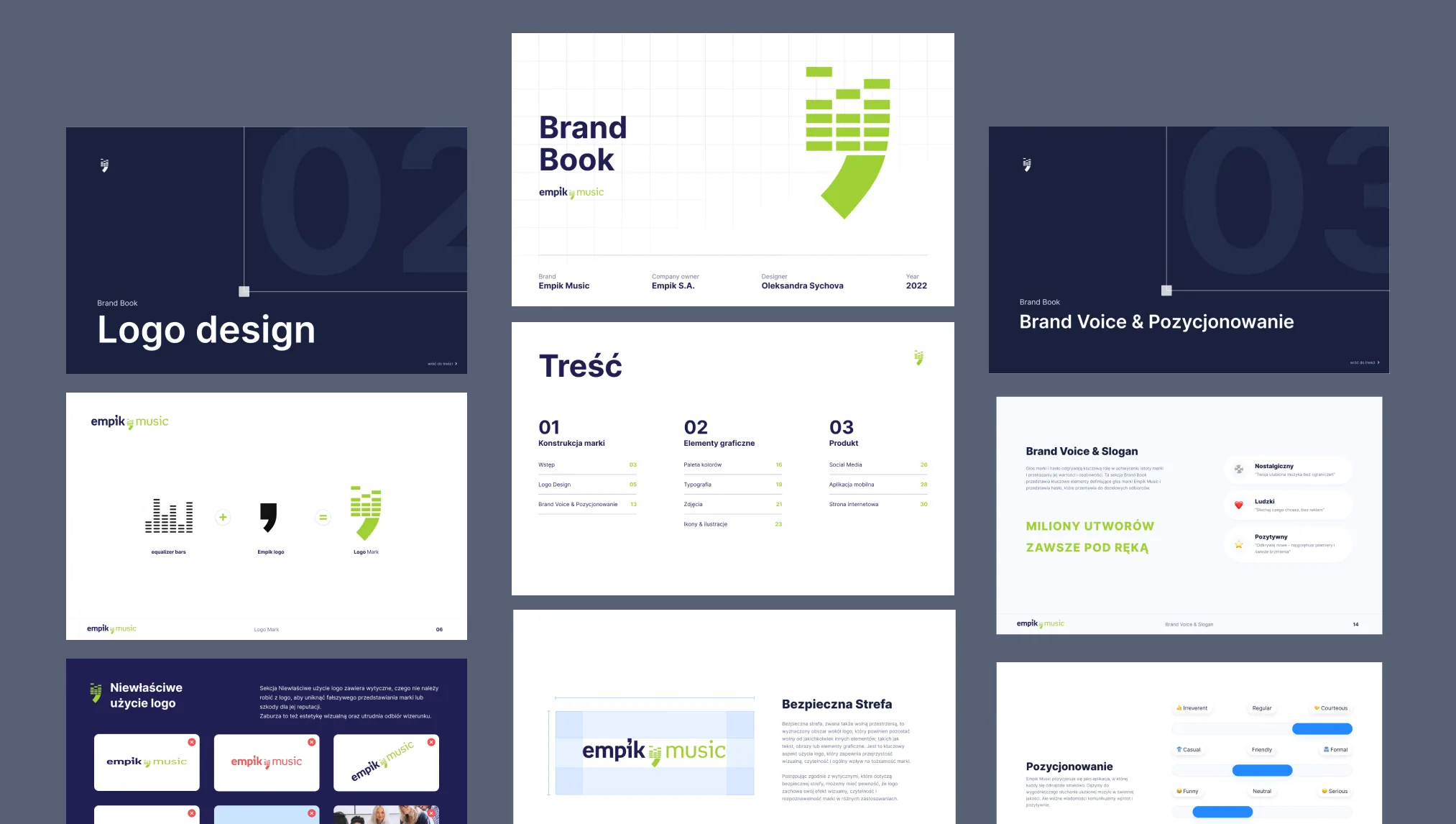
There was no design system, so I built one — colours, type, and a component library with every state defined. It predated design tokens, so I created and maintained it by hand. Documented in Jira and Google Docs, it became the single source of truth engineering shipped on.
-
03 · Redesign
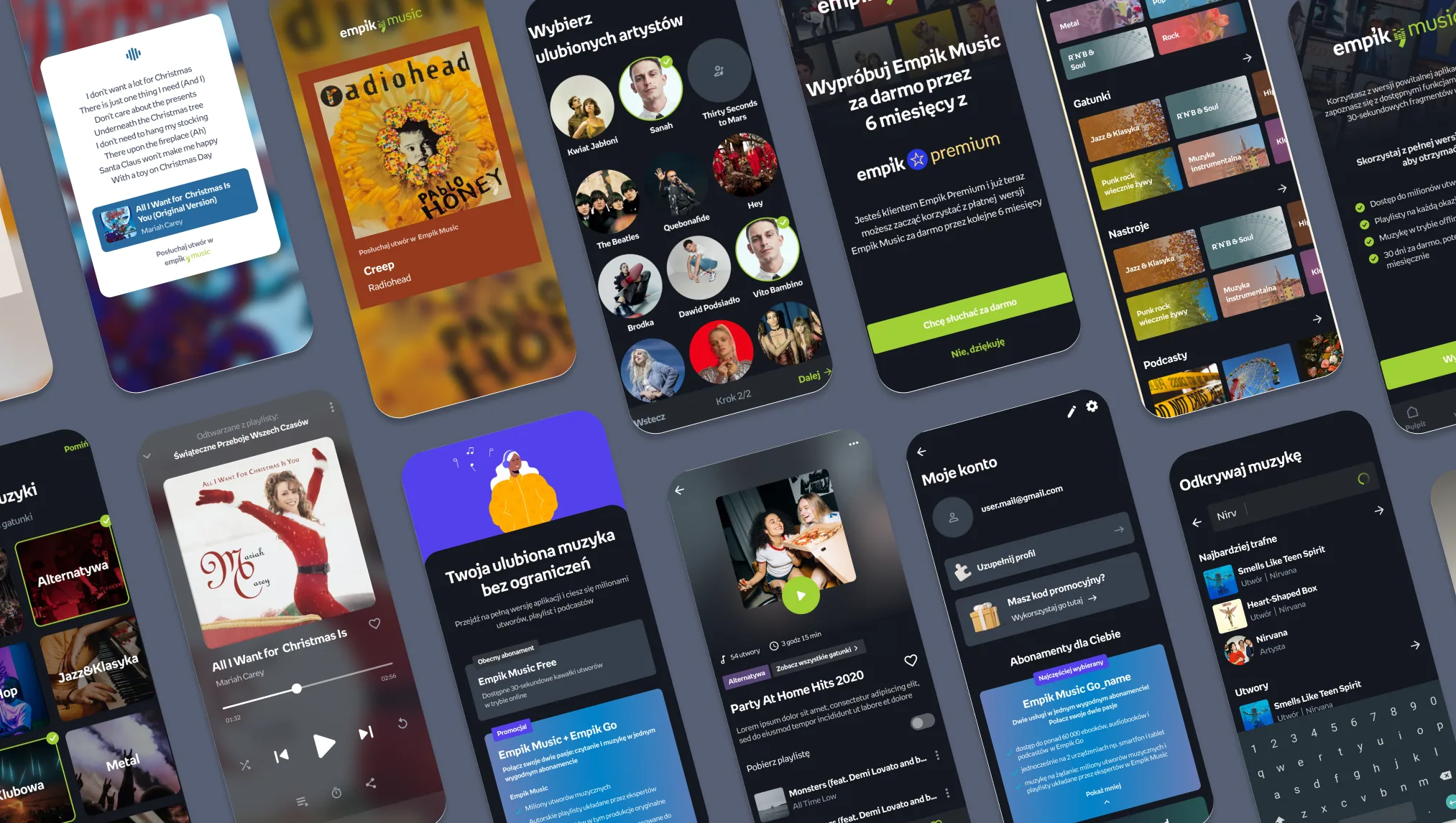
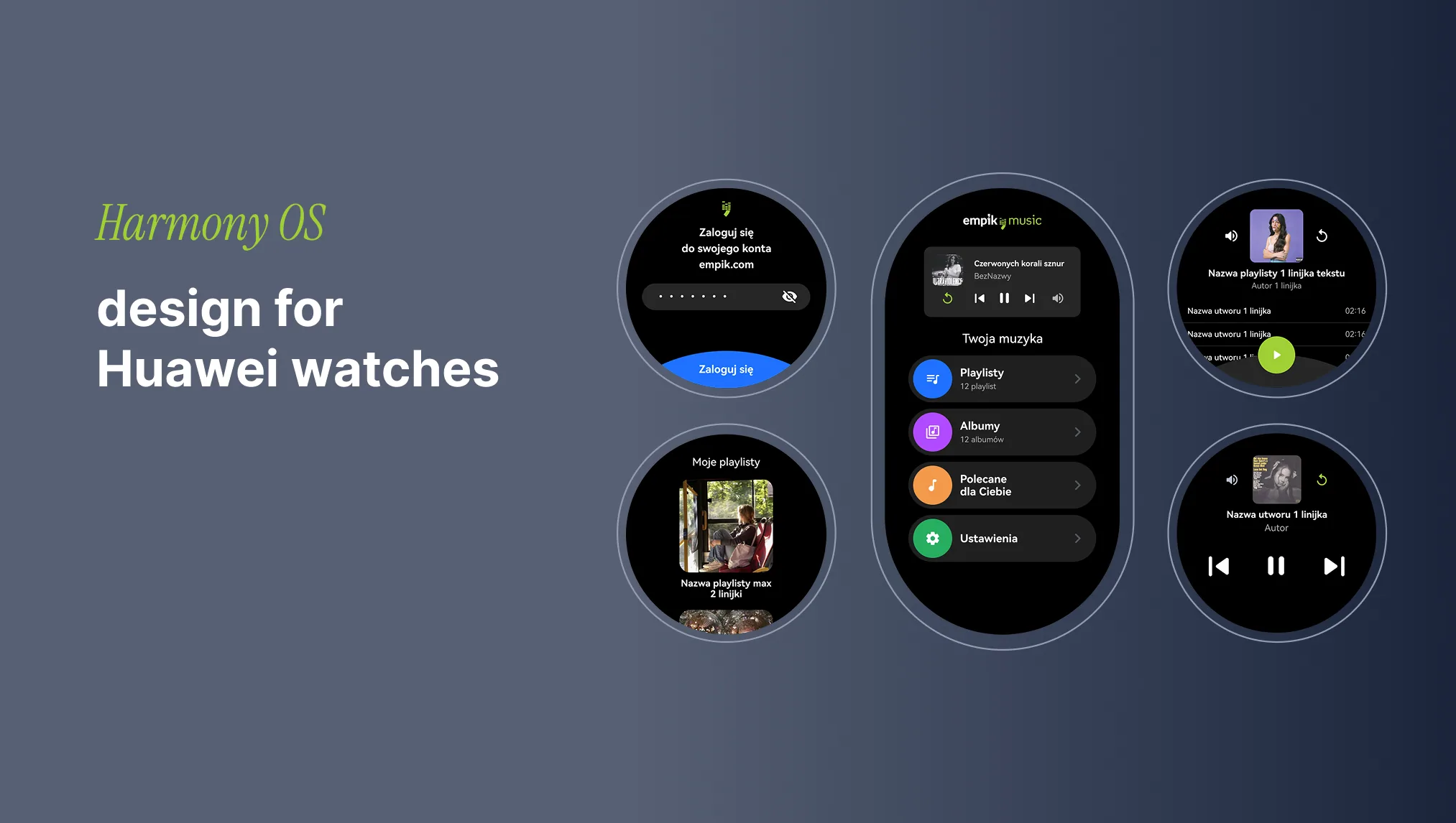
I rebuilt the iOS and Android interface end to end, screen by screen — and designed the HarmonyOS version from scratch, following Huawei's own design guidelines and technical requirements. New features shipped along the way: a premium paywall, sharing song clips to Instagram Stories, and dedicated Stories screens. Users found it clean, intuitive, and current.
-
04 · Landing page
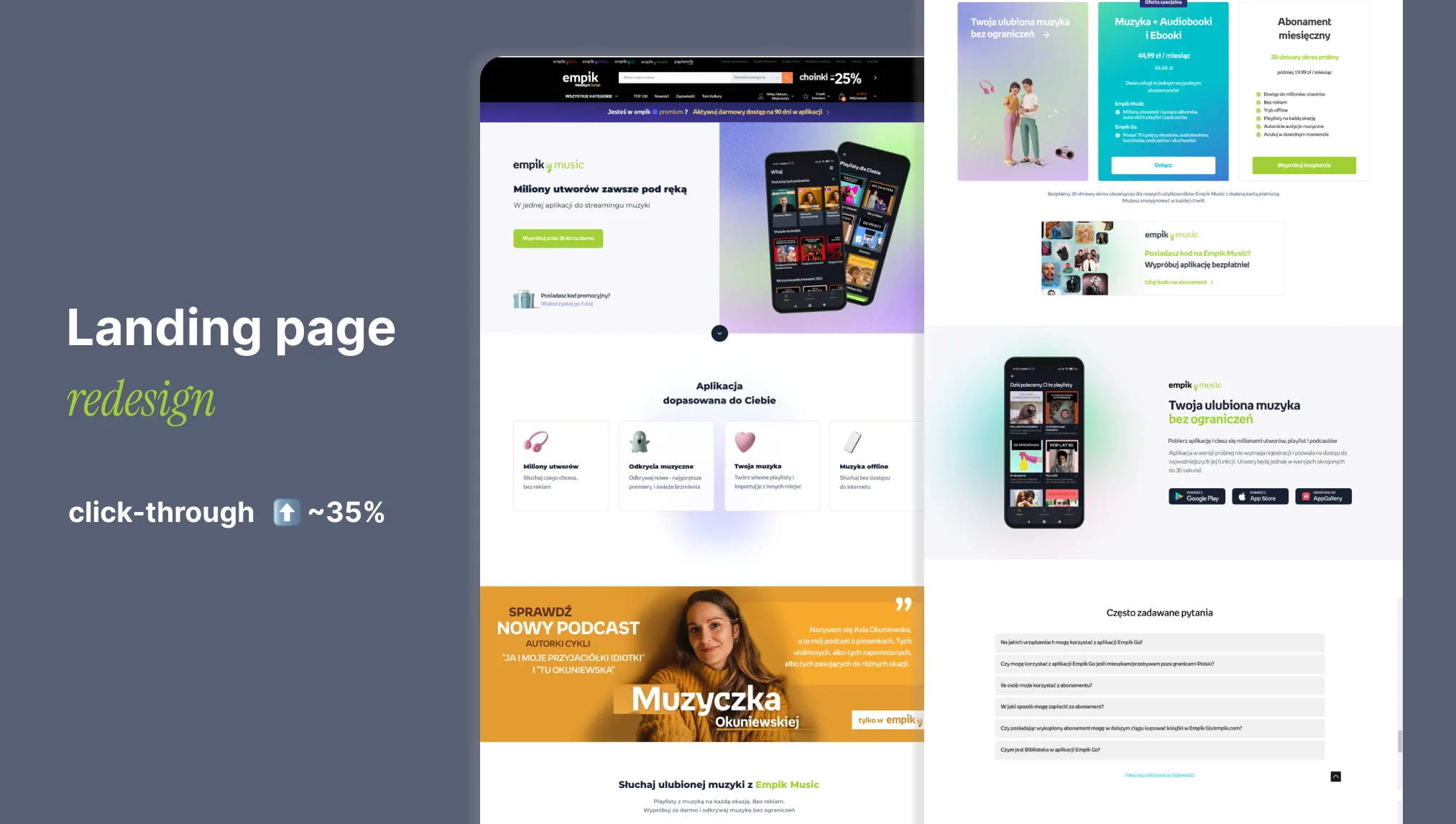
I redesigned the landing page around one job: moving visitors to the App Store and Google Play. Simpler and on-brand, it lifted that click-through by around 35%.
§ 03 — Story 02 · Empik Go

Smart moves, lasting results.
Empik Go — e-books and audiobooks, 1M+ downloads — didn't need a rebuild. It needed focused changes that lasted. Years later, most of it is still in the product.
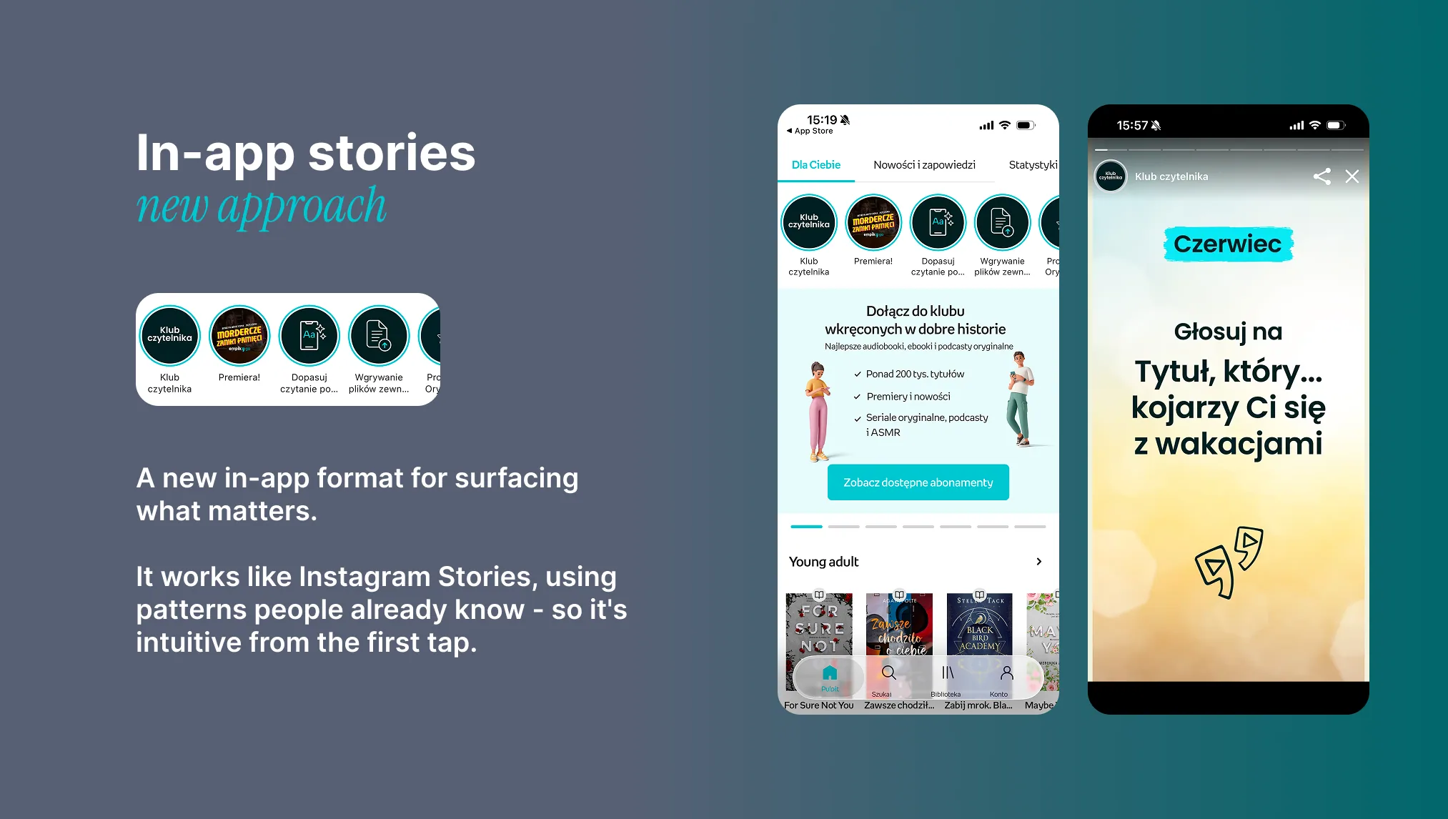
Banner blindness was a real problem — users tuned banners out, leaving no good way to surface new features or run in-app marketing. I found InAppStory, a Stories-style format, and made the case for adopting it. It worked.
Solved banner blindness.
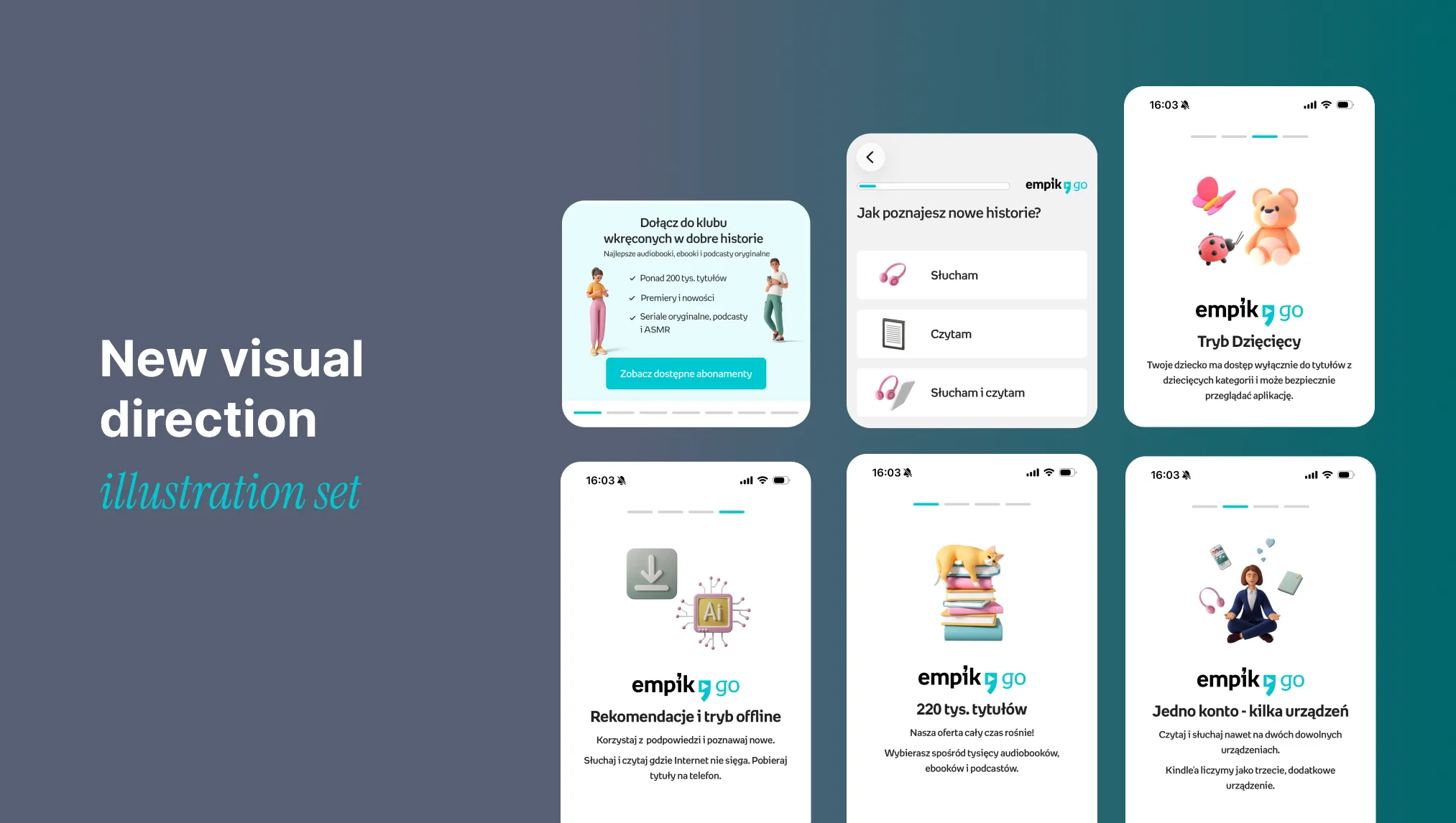
I set a fresher visual direction for the app and built the patterns to apply it consistently — a new illustration set among them. The artwork itself wasn't mine, but the visual approach around it was.
Still in wide use.
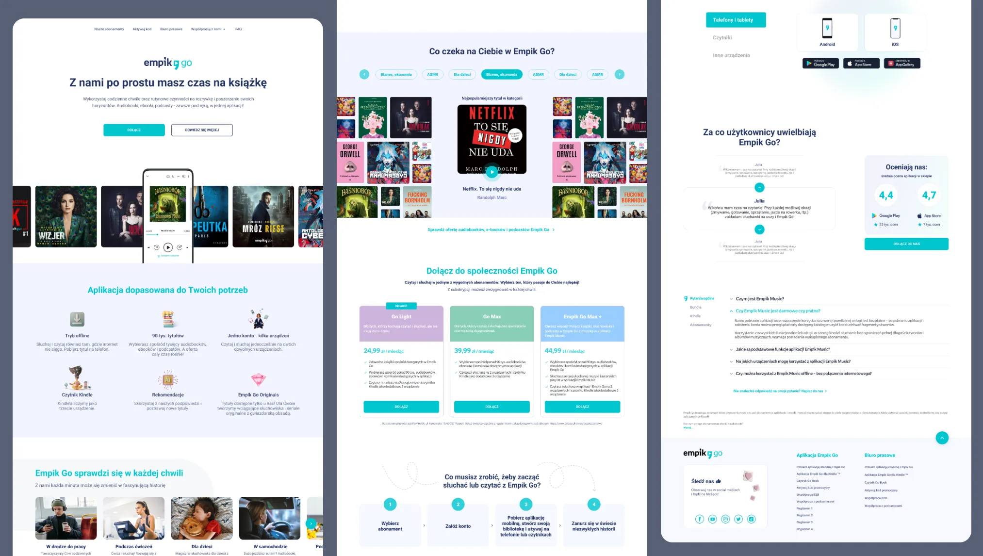
I redesigned the landing page, exploring many variants before the final one shipped. In its first month, subscriptions bought through it rose by around 17%.
~17% more subscriptions through the page, first month.
§ 04 — Story 03 · The bundle
Two passions, one subscription.
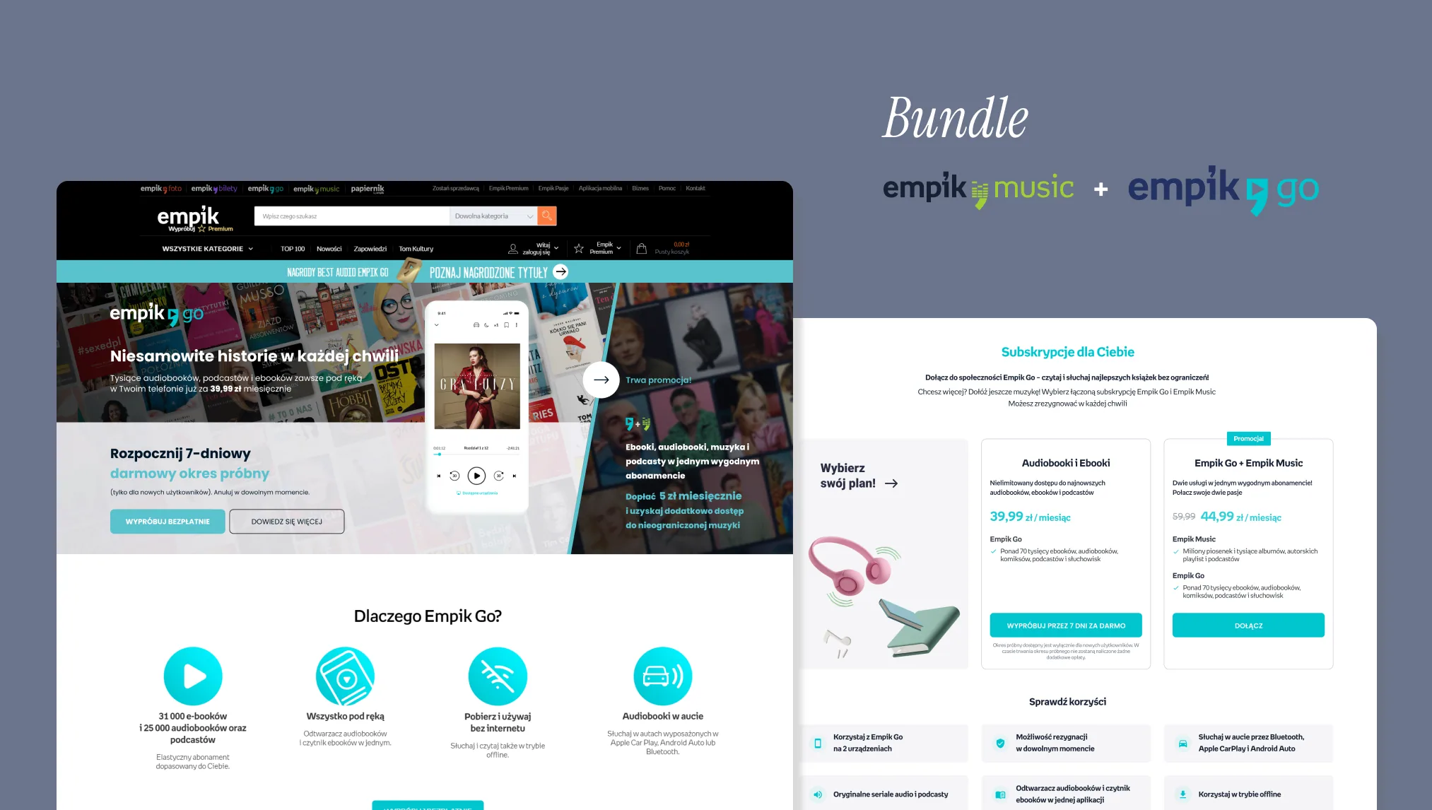
Empik Music and Empik Go were sold separately — two apps, two subscriptions. Combining them into one plan could grow subscriptions and get people using both, not just one. I looked at how other streaming services bundled, took what worked, and presented it to the team.
Then I designed the combined-subscription screen — both apps in one plan, laid out so the bundle read as the obvious choice. It shipped.
§ 05 Reflection
Three things I carry forward from Empik:
- To compete with bigger players, creativity has to be multiplied by analytics — neither wins alone.
- Research doesn't always need a budget — sometimes your best fresh-eyed testers are the colleagues two desks over.
- Where there's no system, I can build one — and get a whole team running on it.