§ Case study · Nationale-Nederlanden · 2022—2025
Three and a half years inside a European insurance and investment group. Designed across three financial products — contributing to Moje NN (1M+ users), leading transitions, and owning two financial products end-to-end.
§ 01 Context
What I walked into.
Nationale-Nederlanden is a European insurance and investment group operating across 11 markets — strong enterprise discipline and regulatory weight in everything it ships.
The Polish design team was 6–10 people across multiple products. My space was at the financial end — PPK, IKE/IKZE, and contributions to Moje NN (1M+ customers).
§ 02 Worked on
Worked on.
The only designer on a pension product — end-to-end design, from feature work to interface decisions.
The only designer on long-term savings products — designed across the full self-service experience.
Designer in a multi-designer team on NN's main self-service platform (1M+ users). Contributed to feature work, design system, and the MetLife migration.
§ 03 — Story 01 · Moje NN
Contributing inside a 1M+ user platform.
Moje NN — NN's main self-service platform for 1M+ customers. I worked on feature requests, improvements, and design system contributions alongside other designers in the team.
Crisis case — indexation.
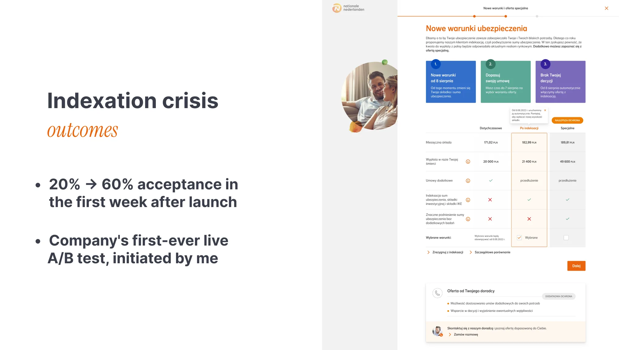
Once a year, every life insurance policy goes through indexation — a small increase tied to inflation protection. The first solution shipped without enough explanation, and most customers opted out, treating it as an unwanted price hike.
Came in as the design lead on the rescue effort. The team moved into a special working mode — tight loops between research, design, product, and content. Reframed the screen around what users actually needed to understand: indexation as inflation protection, not a price increase.
Acceptance grew from around 20% to 60% in the first week after launch. The new pattern was rolled out across NN's life insurance products and stayed as the default approach.
§ 04 — Story 02 · MetLife migration
Integrating MetLife users into Moje NN.
Onboarding users who didn't choose to move.
NN's acquisition of MetLife migrated around 900,000 customers in total, across all markets. I worked on the Polish side — bringing them into Moje NN.
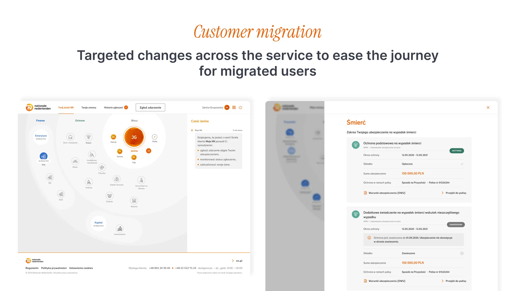
Owned the in-platform side — design decisions, transition flows, and integration with Moje NN. Another designer handled the landing page.
The hard part was human, not technical. These users didn't choose to move, and Moje NN worked differently from what they knew. My job was to guide them through the change, not confuse them.
The work.
- Designed new screens for processes that only existed on the MetLife side
- Adapted NN's existing flows to fit the migrated users
- Worked with legal to write UI copy that explained the changes in plain terms
- Coordinated across several teams, each owning a different part of the frontend
§ 05 — Story 03 · PPK + IKE/IKZE
The only designer — pension and long-term savings.
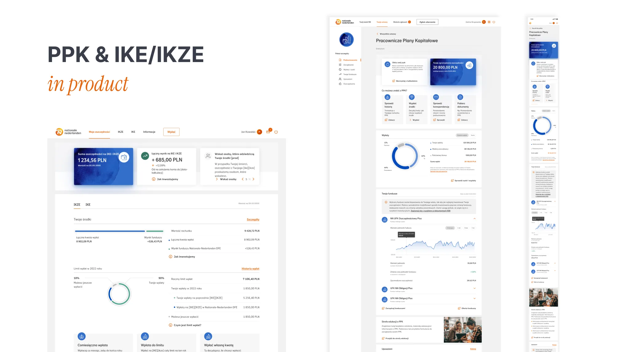
PPK (employee pension) and IKE/IKZE (individual retirement and savings) — two regulated financial products inside NN's portfolio, each with its own user base and stakeholder set.
The only designer on both products. End-to-end ownership: requirements with PMs and stakeholders, design exploration, accessibility, dev hand-off, live iteration.
People already knew this platform well, so the goal was to improve it without breaking familiar paths. I redesigned 70+ screens across desktop and mobile, within the design system, technical constraints, and WCAG — working across internal and external teams.
Here the focus was on optimising the service — making its value clear and bringing in new users, partly through a referral programme. That meant careful copy work (applying NN's plain-language training), WCAG compliance throughout, and integration with the main Moje NN platform.
§ 06 Design system
Design system, accessibility, and plain language.
Across all three products, the design system was the common ground — the work that ran behind everything and reached every customer touchpoint.
Built and maintained the component library used across Moje NN (1M+ users) and the financial products.
ZeroHeight docs for designers and developers — patterns, usage rules, and edge cases.
Improvements aligned with EU standards, with WCAG 2.0 certification (Widzialni Foundation).
Plain-language principles across all copy, from NN's internal training.
§ 07 Reflection
Three things I carry forward from Nationale-Nederlanden:
- Big organisations feel like home now — their structure is something I work within, not against.
- Accessibility and plain language aren't optional — they're the baseline, judged by what each product needs.
- The best work came from teams that shared openly. I carry that habit with me.